![]()
|
|
|
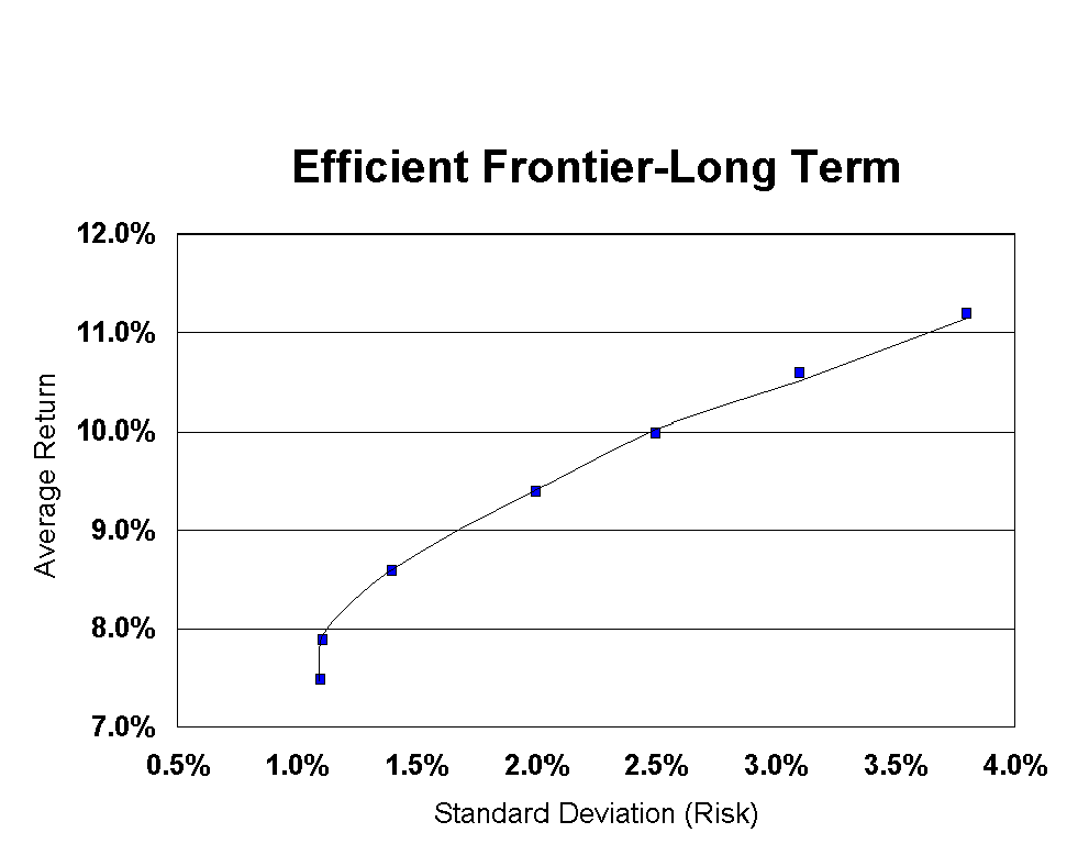
| My original intent was to simply study the dynamics of "fixed percentage withdrawal strategies". This is a withdrawal strategy that has you withdrawing a fixed percentage (say 5%) of your portfolio every year without regard to your expenses. This strategy means that you will never run out of money just like the withdrawal strategies studied in the Market Risk chapter. But unlike the strategy studied in that chapter you allow your withdrawals to rise above your planned income level (after inflation) in cases when your portfolio is doing well. A reasonable expectation for this withdrawal scenario (as compared to Market Risk) is for higher levels of income (on average) but with some increased volatility in annual income levels. This will turn out to be the case. But if you think about what we have done here so far, we have defined two separate factors that determine your income in any given year (as a function of your portfolio value). These are: 1) Fixed Percentage of your portfolio value. Think of this as the 'portfolio performance governor'. It limits your income as a function of your portfolio (totally ignoring your income goals). 2) Your initial income target (adjusted for inflation). Think of this as your 'greed limit'. It limits your income as a function of your preset (but inflation adjusted) income goal without regard for your portfolio performance. The strategies that we have defined set your annual withdrawal to be the minimum of the values determined by one of the two factors above. The Jarrett/Trinity studies set factor #1 to be 100% of your portfolio value and the Market Risk case set these two factors to be equal (in the initial year). So I got very interested in studying how varying these parameters affect your income in the withdrawal stage, and this led me to a study of the "Efficient Frontier for Withdrawals". William Bernstein has an extremely well-done description of the Efficient Frontier that is highly recommended. He has written a book on this subject that used to be available online, but is no longer available in its entirety on the web (too bad, but the book is worth the money based on my reading some time ago in its online form). Frank Armstrong's Investing for the 21st Century is also an excellent source of information in this area. In a paragraph the Efficient Frontier looks at various asset allocations from a set of asset classes (such as Large Company Growth, Small Company Value, Short Term Investment Grade Corporate Bonds, etc.) and tries to find the asset allocation that minimizes the "risk" while achieving a given level of expected return. "Risk" is typically defined as "how much can the real result be different than the mean or expected value". It is usually quantified as the standard deviation of the returns (a statistical measure of the amount of variation in a set of numbers). A couple of years ago I paid (with assistance from my employer) for a financial analysis of my savings plan with respect to my goals. Below is a sample of one of the Efficient Frontier graphs that I received as part of the work done for me.
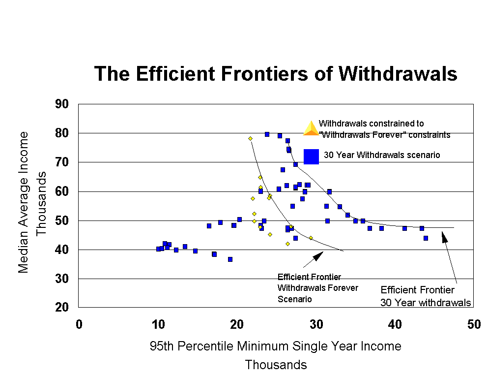
I believe that this curve addressed results over "the long term" but I'm not sure what the exact definition of "long term" was. To read this curve look at the point at 10% average return and a standard deviation of 2.6%. This point means that there is an asset allocation that will generate a 10% return (on average) over a "long term" but with a standard deviation of 2.6%. 97.7% of the time the outcome from a statistical sample will be greater than the mean minus two standard deviations. So when we look at this chart we learn that there was an asset allocation that, 97.7% of the time will generate a return (over "the long term") of greater than 4.8% (10% -2x2.6%). But what is important is that there were no other asset allocations that generated an average return of 10% with a smaller standard deviation than 2.6%. There were asset allocations that generated smaller standard deviations, but they generated smaller average returns. There were asset allocations that generated larger average returns, but also larger standard deviations. The analysis in my case was based on 8 or so asset classes, so there are a lot of combinations to analyze to find this curve. An analytical technique called Mean Variance Optimization is used to find this curve from an input/output equation and the statistics of the inputs (the performance and correlations of the various asset classes in this case). If the asset classes operate in the future like they have in the past then an accumulation phase investor would want to pick a point on the Efficient Frontier curve as this would minimize the investor's risk for a given expected return. So I set out to explore the Efficient Frontier for the withdrawal phase. In this case we need to measure income achieved vs. 'risk', rather than portfolio return vs. risk. The measure of income achieved that I chose was the median value of the average (inflation adjusted) incomes achieved over the same 54 different 30 year periods that we have been using in this study. It would have been simple (and meaningful) to chose standard deviation of income achieved as the measure of risk. While I like the mathematics of this selection, it requires an extra level of calculation before it makes sense to an investor (at least an investor like me). For example, a professor of finance would correctly say that an investment with an average return of 15% and a standard deviation of 3% carries more risk than an investment with an average return of 9% and a standard deviation of 1%. But you have to go out beyond 3 standard deviations (probability of .13%) before the 'risker' investment under-performed the 'safer' investment. I personally would view the asset with the 15% return/3% SD as being less risky. So I chose as my measure of risk the 95th percentile minimum single year income across all of the 54 different 30 year simulations. To do this I took the 54 different worst single year incomes and found the 95th percentile minimum from this set of numbers. This is kind of a measure of "how bad might it get". I chose the 95th percentile (only 5% were worse) rather than the absolute worst case because I was concerned that the worst case would always be the same year in the same simulation. The approach that I am using hides some of the variation in the simulation results and this seemed like a reasonable compromise. It is arbitrary and other choices (say 90th percentile, or 98th percentile) would yield somewhat different results. More importantly it is a number that you can look at and relate to instantly without any mental arithmetic or normal distribution value table lookups, which was the whole motivation in not using SD in the first place. So here is what we have that can vary. 1) The asset allocation 2) The two withdrawal parameters discussed previously in this chapter ("Portfolio Performance Governor" and "Greed Limit") The goal is to find the 'Efficient Frontier of Withdrawals' which will tell us what asset allocation and withdrawal parameters will, for a given median/average income minimize the 95th percentile minimum annual income. What I did was to do a bunch of simulations, play with the results, and try to find the points that optimized income/risk equation (and I developed a hearty appreciation for Mean Variance Optimization). I did this for the case where I ignored the end portfolio value (other than to assure that it was greater than zero) and for the case where I constrained the analysis to cases that always ended (after 30 years) with the same or larger portfolio value as at the beginning (Withdrawals Forever case). I used the same four asset allocations as in the previous analyses. Here is the graph.
The yellow triangles describe the data points that match the Withdrawals Forever constraints and the blue squares only require a non-zero ending portfolio value. This was done against the same $1,000,000 initial portfolio as before. The following data are points pulled from the Efficient Frontier. 30 year withdrawal scenario (non-zero ending portfolio value) starting with $1M.
'Withdrawals Forever' scenario (starting with $1M)
SO WHAT!!!!!!!!!!!!!!!! We've seen the data so what conclusions might reasonably be drawn? The first conclusion is that this analysis tends to fall into the same trap as many unconstrained Mean Variance Optimizers. I have not experienced this (because I haven't tried it as I have not ever exercised a genuine Mean Variance Optimizer piece of software). But they have a reputation for giving results like: You get a reasonable asset allocation yielding a long term average return of (for example) 11.2% with a (long term) standard deviation of 2.3%. You decide that you are willing to take just a bit more risk to try for an average return of (for example) 11.6% and the results tell you to move 27% of your assets into Pakistani small cap value stocks. In other words I am suspicious of doing any more than viewing this data in very general terms. But this general view does seem to have some value. So here are some observations that seem reasonable to me. 1) Aggressive equity allocations would appear to be the most efficient even when trade-offs against volatility are made. 2) Withdrawal strategies defined strictly as a fixed percentage of your portfolio show up frequently leading me to believe that, in general, this is a pretty efficient withdrawal strategy. This seems to be particularly true when trying to maximize your income opportunities (see my comments late in the Withdrawals Forever chapter). 3) The fixed, inflation adjusted withdrawal scenario (ala' Jarrett/Trinity) does not show up on the Efficient Frontier, although the 4.4% with 40% equity ratio discussed in the Methodology chapter isn't too far off this curve. In general, though, I would judge this to be a relatively inefficient withdrawal methodology. But mixing this with the constant percentage limitation seems to offer some value. I'm not sure that I would draw any other conclusions from this data at this point. But I found the data fascinating (sorry - I'm a numbers kind of guy). Also note that the 95th percentile number, while easy to relate to, has the potential to hide a lot of data/variation. For example (in principle) all but 5% of the income values could be the same with just the bottom 5% varying dramatically. This is indistinguishable based on the data that I produced from the (more likely) outcome of the results being spread out in a more normal distribution. I haven't looked into this and if I had it to do all over again I might not chose this methodology, but ... Again this data concludes that high equity allocations are (or more specifically 'were') the most efficient. But the success of this strategy would require guts (if you will) in those cases where unlucky timing (say a 40% market drop the first year of retirement) decimated your equity dominated portfolio. The data is the data, but personally I am very reluctant to consider 80% equities when I get to the withdrawal stage of my life, despite the analysis that I have done. As a final note I believe that anyone who wanted to take this really seriously and do some "peer reviewable" quality work would quickly go back to standard deviations and to genuine asset class statistics, rather than the discrete Ibbotson data based simulations and artificial 95th percentile based work that I have done. |