![]()
|
|
|
|
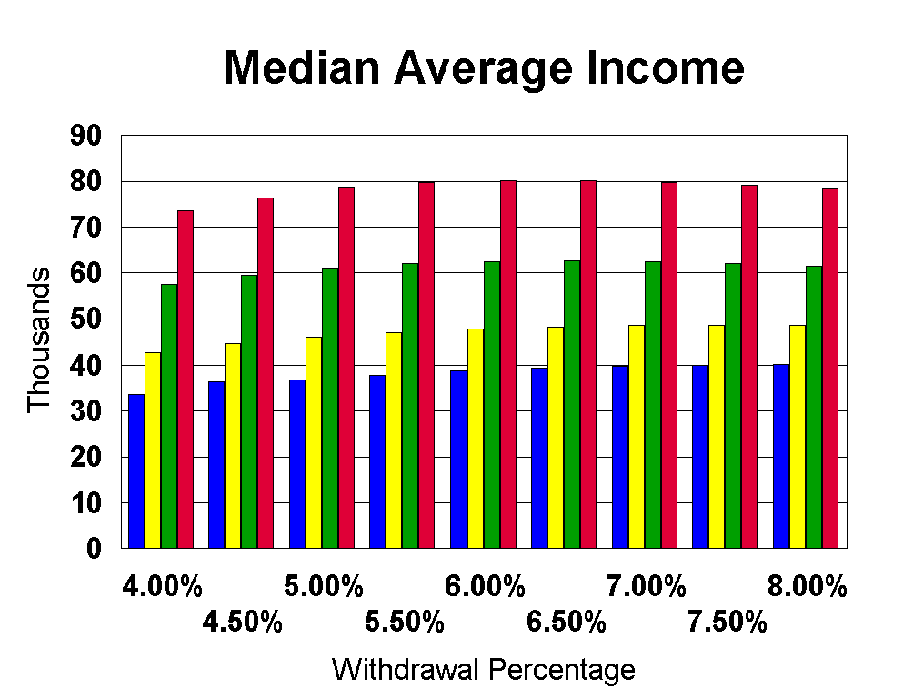
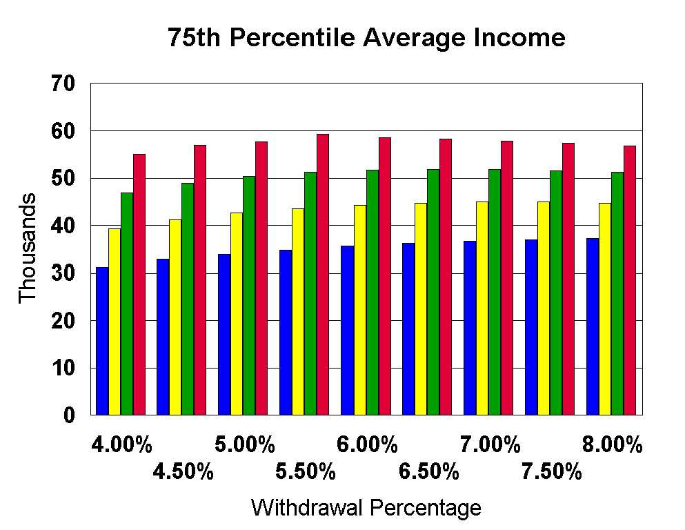
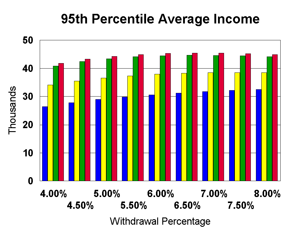
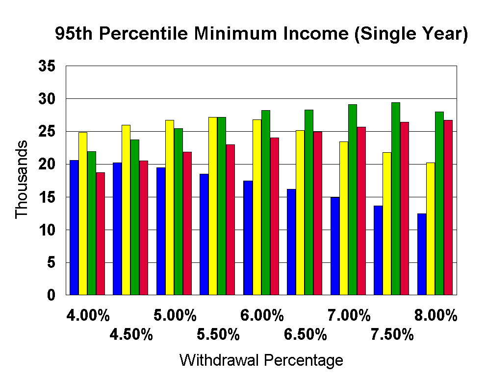
The Efficient Frontiers chapter discussed methodologies that would try to minimize the variability in your income (risk) while maximizing the expected income from your retirement savings. As was noted the withdrawal methodology of simply withdrawing a fixed percentage of your assets each year showed up often on the Efficient Frontier indicating that it is a relatively efficient withdrawal methodology. It is also simple, understandable, and makes intuitive sense so I have done some additional analysis of this methodology in this chapter. Again I have used the same methodology as described in the Methodology chapter. Using the same asset allocations as discussed previously I simply explored the results of various fixed withdrawal percentages on the resulting income streams. I varied the withdrawals from 4% to 8% of your initial $1M asset pool and simulated that against the Ibbotson market data from 1926 through 1998. Again this is 54 different 30 year retirement simulations (retirement starting in 1926 and ending in 1956, retirement starting in 1927 and ending in 1957, ..... etc.). I will be presenting data taken from this analysis in both aggregate form as well as individual year form. The first three charts deal with the average incomes (adjusted for inflation) that were achieved for each of the 54 different 30 year retirement periods. 1) The median (half more, half less) of the 54 different (inflation adjusted) average incomes. 2) The 75th percentile minimum taken from this same set of numbers (75% of the average incomes were better). 3) The 95th percentile minimum taken from this same set of numbers (95% of the average incomes were better). These charts deal with average values across an entire retirement scenario, but do not deal with the volatility within a retirement scenario. The second set of charts deal with the individual year volatility. I recorded the minimum income year (adjusted for inflation) that was encountered in each of the 54 different retirement scenarios and present the following data. 4) The minimum single year income encountered (the lowest single year income encountered in the entire simulation of 54 different 30 year retirement scenarios). 5) The 95th percentile minimum single year income encountered (95% of the 54 different 30 year retirement scenarios had a minimum income that was higher). 6) The 75th percentile minimum single year income encountered (75% of the 54 different 30 year retirement scenarios had a minimum income that was higher). Now for the data. We'll start with the average income statistics defined in #1-3 above..
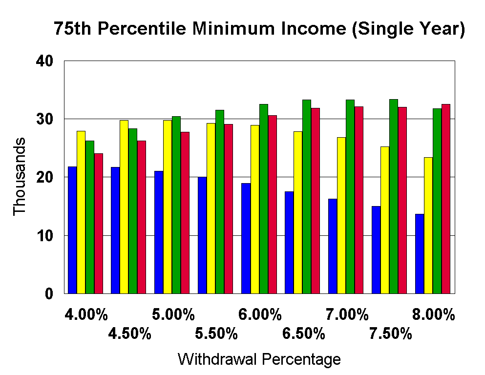
As would be expected the higher equity allocations achieved the higher average income values. This was true for both the median case and for the 95th and 75th percentile minimum cases (recall that in these cases we are looking at the average incomes achieved across 30 year retirement scenarios, not individual years which will be studied next). It is also interesting that, even when viewing the 95th and 75th percentile minimum incomes achieved, lower percentage withdrawals (less than 5%) would not appear to be the optimum strategy if maximizing your total income is your goal. Note that I did not put any constraints on the ending value of the portfolio (see Withdrawals Forever), although this particular withdrawal technique does guarantee that your portfolio will never be completely exhausted. If you recall the beginning of this study we started with the Trinity/Jarrett studies which supported an inflation adjusted withdrawal of $44,000 from a beginning $1M portfolio. I found it fascinating that the 95th percentile minimum average income was approximately that same value. But the methodology that this data would suggest is an asset allocation of 60 to 80% equities and a withdrawal percentage of 6 to 7%. The data also suggests that the fixed withdrawal methodology combined with the 40% equities and 4.4% withdrawal percentage is a much less efficient withdrawal methodology. Note that this is NOT the withdrawal scenario suggested by the Trinity/Jarrett studies which suggested withdrawals that were not a function of internediate portfolio values. Of course there is no guarantee that what is true in the past will be true in the future. The lower withdrawal strategies will obviously leave a larger ending portfolio which could be important if either the size of your estate or retirement horizons longer than 30 years are important to you. Next we'll take a look at annual income volatility. We'll be looking at the data in #4-6 at the top of this page. Again we are starting with the minimum (inflation adjusted) annual income in each of the 54 different 30 year retirement scenarios.
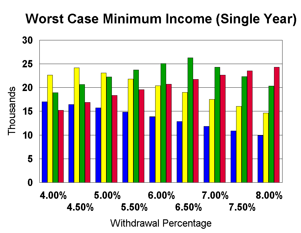
It is important to remember that the data presented here does not put any limitations on the ending portfolio value, other than the fact that a fixed (less than 100%) withdrawal amount does assure that your portfolio is never exhausted. But from the data in the previous charts it is relatively simple to assess the minimum (inflation adjusted) portfolio values encountered in these simulations. Take (for example) the Worst Case Minimum Income (Single Year) graph above for the case of 60% equities and a 6% withdrawal rate. The minimum withdrawal of $25K and 60% equities leads directly to the fact that the minimum portfolio value associated with this particular withdrawal methodology was 25,000/.06 = $416,667. The minimum portfolio value associated with the same asset allocation and 4% withdrawals is $19,000/.04 = $474,000. This isn't a huge difference (ratio of 1.14) in minimum portfolio value given a 50% difference in withdrawal rates. If the absolute worst case historical event is your primary focus then clearly market conditions, rather than withdrawal rates, will dominate your portfolio/withdrawal results. But if we look at the 75th percentile rather than the worst case then we see the following. 60% equities/6% withdrawals implies a 75th percentile portfolio minimum of $32,000/.06 = $533,000. 60% equities/4% withdrawals implies a 75th percentile portfolio minimum of $27,500/.04 = $687,000. The ratio is 1.29 rather than 1.14 as before. But I am really struck by the relative effects of market performance vs. withdrawal percentages that are exhibited here. This data leads me to the conclusion that the most efficient withdrawal strategy is a relatively aggressive withdrawal target (along with the recognition that you may end up withdrawing a lot less). The market conditions that you encounter are the dominant factor. Of course reducing your withdrawals does ALWAYS increase your minimum/ending portfolio value. The Efficient Frontiers chapter was (an admittedly weak) attempt to try to find the optimum trade-offs in this area. Once again I feel compelled to stress the fact that intense and accurate analysis of historical data is not the same as accurate prediction of future results. I'm going to go ahead and post this data as is, even though I feel that I need to think this through more. However the private emails that I receive at DaveLeeMn@spinfinder.com always open my eyes to factors that I might have otherwise ignored.
|