![]()
![]()
|
|
|
|
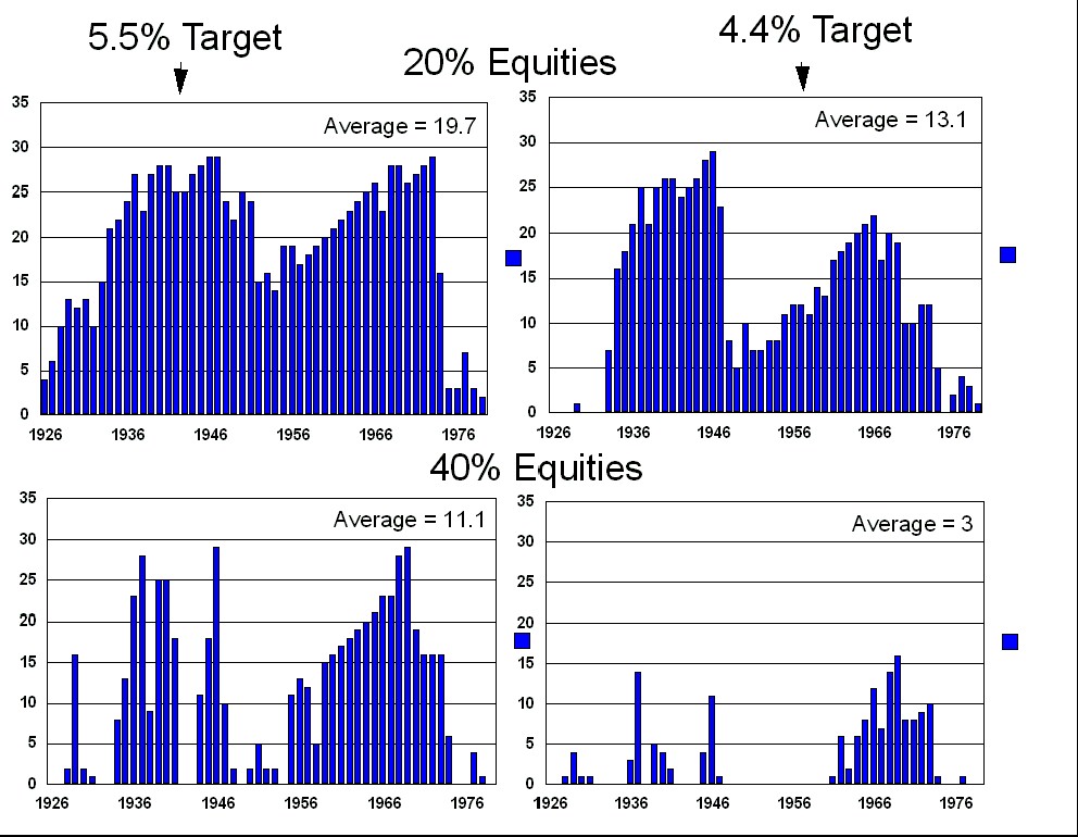
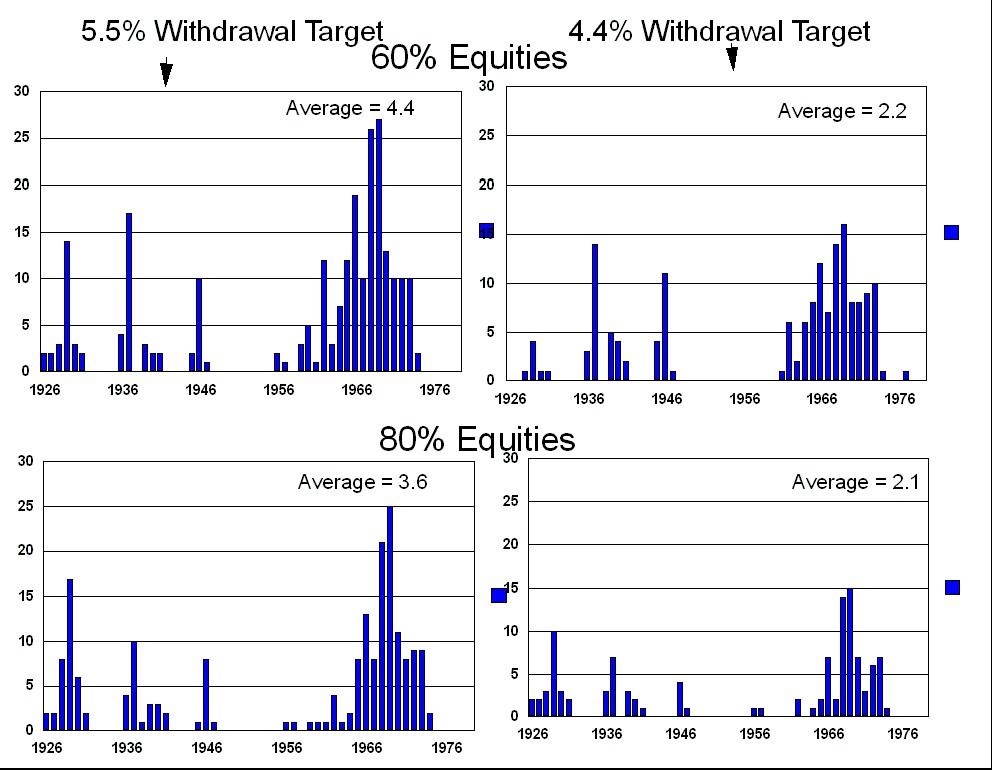
The following graphs show the number of years (for each of the 54 different 30 year retirement scenarios) that you would have encountered an income drop of greater than 10% of your targeted income. This data was generated using an initial portfolio value of $1,000,000, and compares the income volatility of the inflation adjusted withdrawal targets of $44,000 vs. $55,000. See the Methodology chapter for the exact withdrawal methodology. Note that this analysis does not differentiate between an 11% drop and a 25% drop - both are greater than 10% and that is all that is recorded here. Note also that for the 5.5% withdrawal case there were some starting years (such as 1969) where (regardless of asset allocation) you rarely hit your 5.5% withdrawal target. I also found it interesting that the 'volatile' asset allocation of 80% equities significantly reduced this measure of volatility (over the other asset allocations). To see why see the next graph (Worst Case Year) where you will see that the real cost of the more aggressive asset allocation was a larger income reduction in really bad years.
|