![]()
![]()
|
|
|
|
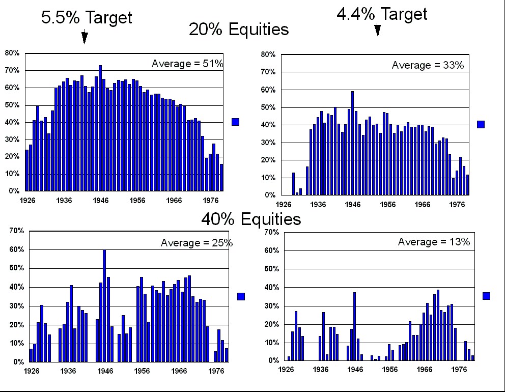
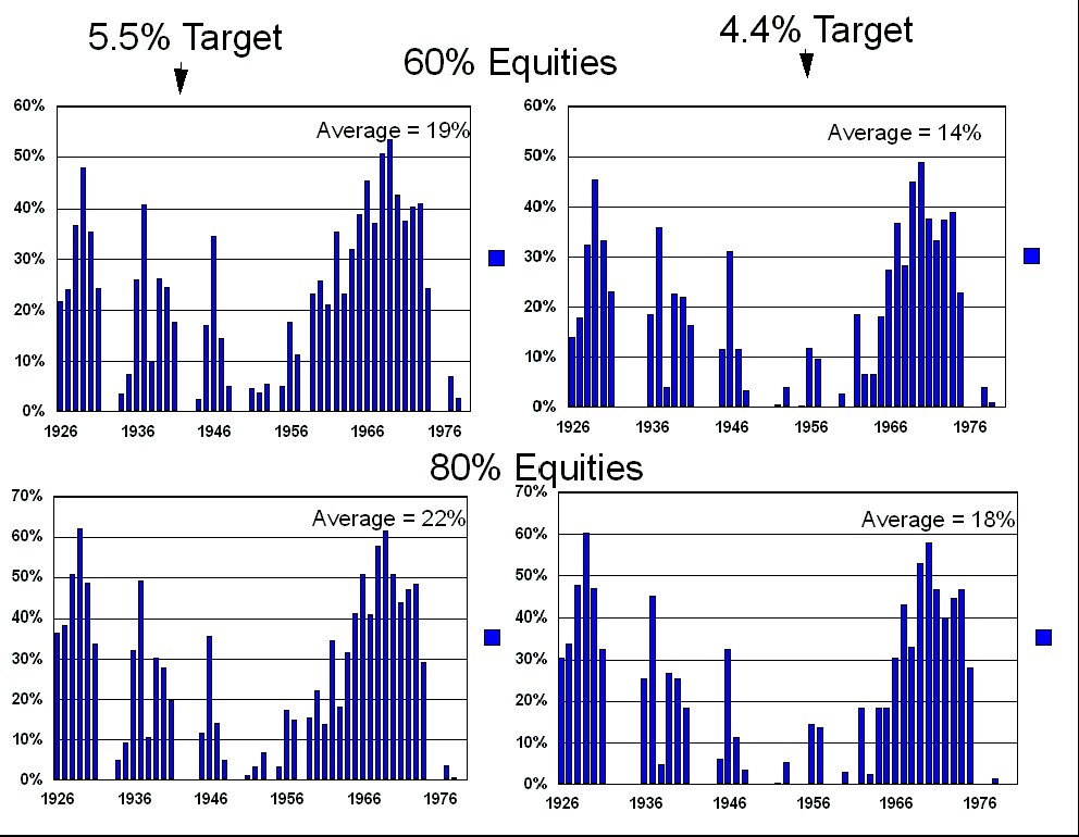
The following graphs show the largest (inflation adjusted) income drop for each of the 54 different 30 year retirement scenarios. This data was generated using an initial portfolio value of $1,000,000, and compares initial withdrawal targets of $44,000 vs. $55,000 using the asset allocations listed. See the Methodology chapter for the exact withdrawal methodology.
|