![]()
![]()
|
|
|
|
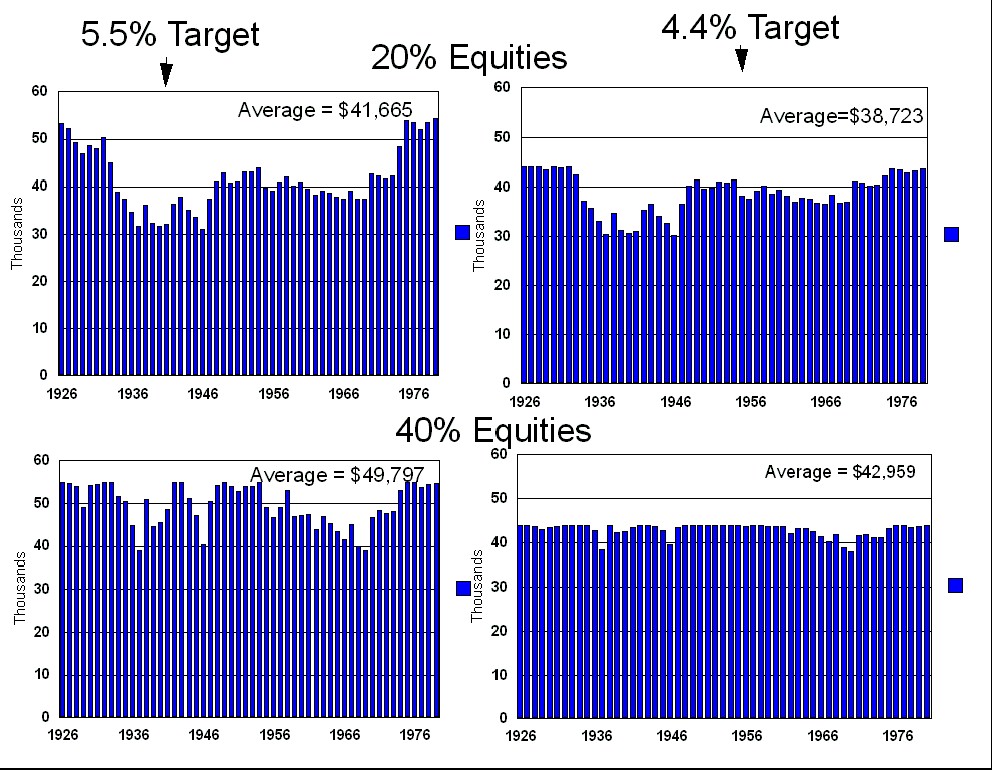
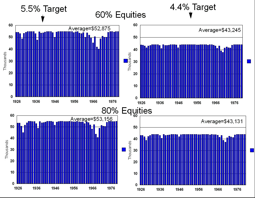
The following graphs show the average (inflation adjusted) income for each of the 54 different 30 year retirement scenarios. This data was generated using an initial portfolio value of $1,000,000, and compares the initial withdrawal target of $44,000 and $55,000 with the asset allocations listed. See the Methodology chapter for the exact withdrawal methodology. Note that there are some starting years where the 5.5% withdrawal target and the 4.4% withdrawal target generate roughly the same average income. There aren't years where the 5.5% withdrawal target actually generates a lower (inflation adjusted) income.
|