![]()
![]()
|
|
|
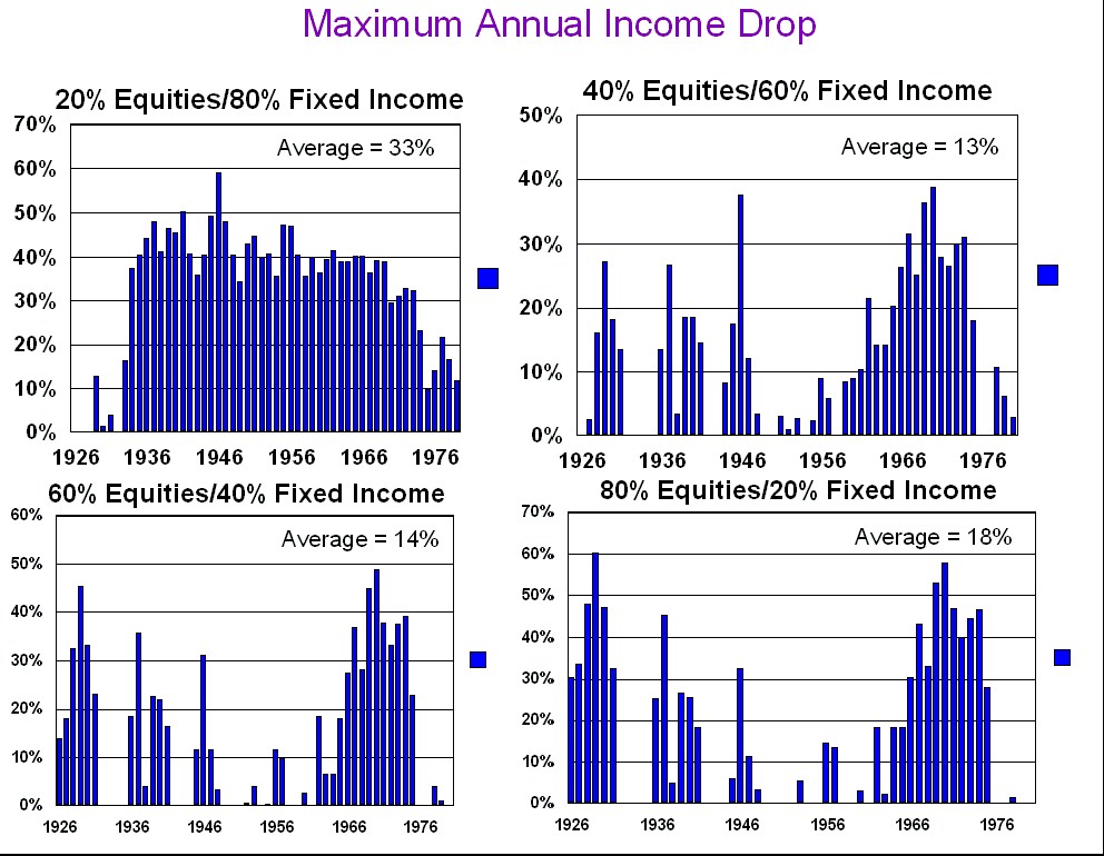
The following graphs show the largest (inflation adjusted) income drop for each of the 54 different 30 year retirement scenarios. This data was generated using an initial portfolio value of $1,000,000, an initial withdrawal target of $44,000, and the asset allocations listed. See Methodology for the exact withdrawal methodology. An interesting thing to note is that 30 year retirement scenarios where you encounter no (inflation adjusted) income drops at all are not the norm. I was surprised at this.
|